HTML and CSS on jsFiddle
HTML and CSS on jsFiddle
Before implementing jQuery, we need to create a series of HTML objects and style them via CSS.
To create a microsite, we will first need a <div> element responsible for holding all the elements together:
<div id="container">
</div>
... Which will be split into three sections: logo, navigation, and content.
<div id="container">
    <div id="logo"></div>
    <ul id="menu"></ul>
    <div id="content"></div>
</div>
Note that our "menu" item is set in <ul> instead of <div>. Nowadays, best practices regarding navigation items include treating menu items as "list items." We will be using <ul> tags, originally designed to accommodate unordered lists, to construct menu items.
Each of the three sections will now be populated with relevant (or placeholder) content:
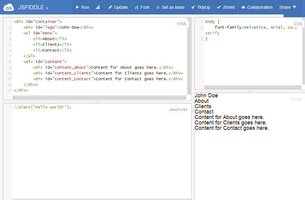
<div id="container">
    <div id="logo">John Doe</div>
    <ul id="menu">
        <li id="menu_about">About</li>
        <li id="menu_clients">Clients</li>
        <li id="menu_contact">Contact</li>
    </ul>
    <div id="content">
        <div id="content_about">Content for About goes here.</div>
        <div id="content_clients">Content for Clients goes here.</div>
        <div id="content_contact">Content for Contact goes here.</div>
    </div>
</div>
Note that our "logo" section now contains a simple text ("John Doe"), and that our "menu" list contains three child <li> tags -- representing the three navigation items. Our "content" section also contains three additional <div> tags, each representing the content that will display upon interacting with each navigation item.
At this point, your fiddle should look like the following:
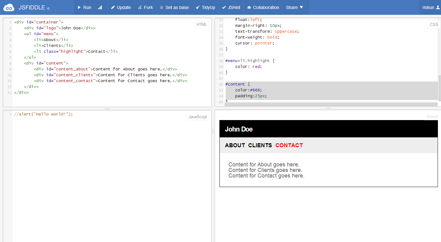
We can now proceed with styling each element via CSS. First, we can define the dimensions and additional styles for our parent element, "container." Let us use selector "#container," as this tag has an identifier (ID), instead of a class name:
#container {
    width:640px;
    background-color:#fff;
    border:1px solid #000;
    margin-left:auto;
    margin-right:auto;
    margin-top:30px;
}
In the same fashion, let us define the style for our "logo" section:
#logo {
    font-size:20px;
    letter-spacing: -1px;
    background-color:#000;
    color:#fff;
    overflow: hidden;
    font-weight:bold;
    padding:15px;
}
Next, let us define the styles for the navigation bar. We need to make sure that each <li> tag floats to the left, and that the container holds all the navigation items together:
#menu {
    overflow:hidden;
    padding:15px;
    background-color:#eee;
}

#menu>li {
    float:left;
    margin-right: 10px;
    text-transform: uppercase;
    font-weight: bold;
    cursor: pointer;
}
Before we move onto styling "content" section, let us insert one more navigation-related CSS rule. Because we want to indicate which item has been "activated" upon click, let us create a class named "highlight":
#menu>li.highlight {
    color: red;
}
If you would like to see the above style in action, feel free to append class="highlight" to one of the <li> tags.
As we are simply dealing with text content, CSS rules for "content" section should be an easy one:
#content {
    color:#666;
    padding:25px;
}
I would say we are pretty much done with HTML-CSS set up. Below is the screenshot of our progress thus far:
Screencast Recording
https://www.dropbox.com/scl/fi/k3c3ypelvjz33g70yw91x/Page-2.mov?rlkey=eyp1vfwfbwdfiovasec14migz&dl=0