Plugin: Bootstrap Framework
(Sample available at http://jsfiddle.net/riskun/orumz7tb/)
Introduction
Bootstrap (http://getbootstrap.com/) is an immensely popular front-end framework for developers who wish to optimize their workflow while ensuring customizability and flexibility. Its diverse preset components are sufficient for building a competent website with no custom CSS code, and the framework also provides a few key plugins that help usability.
As part of this exercise, you will need to closely review this guide as well as Bootstrap's thorough documentation (http://getbootstrap.com/docs/4.6/getting-started/introduction/).
Getting started
Start a new jsFiddle page, and visit the "Quick Start" section of the documentation.
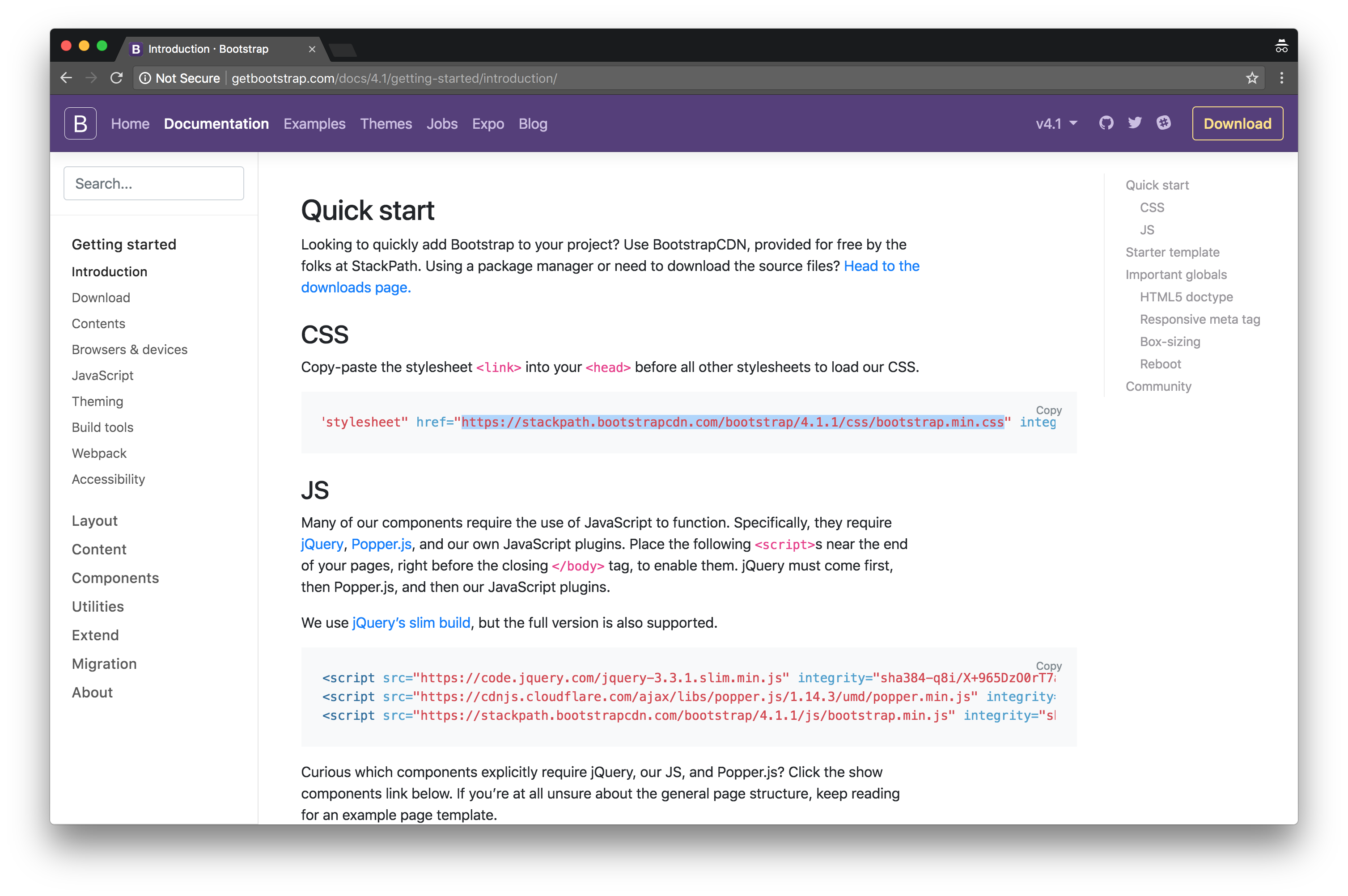
As we are simply interested in the preset components provided as part of Bootstrap CSS, copy the URL to the remotely-hosted CSS file, and make a link in your fiddle:
This is equivalent to creating a tag in the
section of your HTML file. We will return to this section down the road as we add more plugins to this fiddle.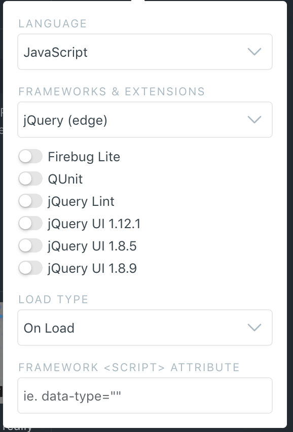
Ensure that the latest version of jQuery is activated as part of this fiddle. (Update: since the recent update to jsFiddle, jQuery version must be set to 3.3.1).
Layout Grid
Arguably, one of Bootstrap's strongest features is its layout engine that allows developers to construct rigorous, responsive layouts with ease.
While you are encouraged to consult Bootstrap's exhaustive guide (http://getbootstrap.com/docs/4.6/layout/overview/), you can simply remember that Bootstrap simply works in a 12-column grid. This means that you can go ahead and split the horizontal space into twelve parts and proceed with constructing different column permutations: you can make as many columns as you would like, as long as the column sizes add up to 12.
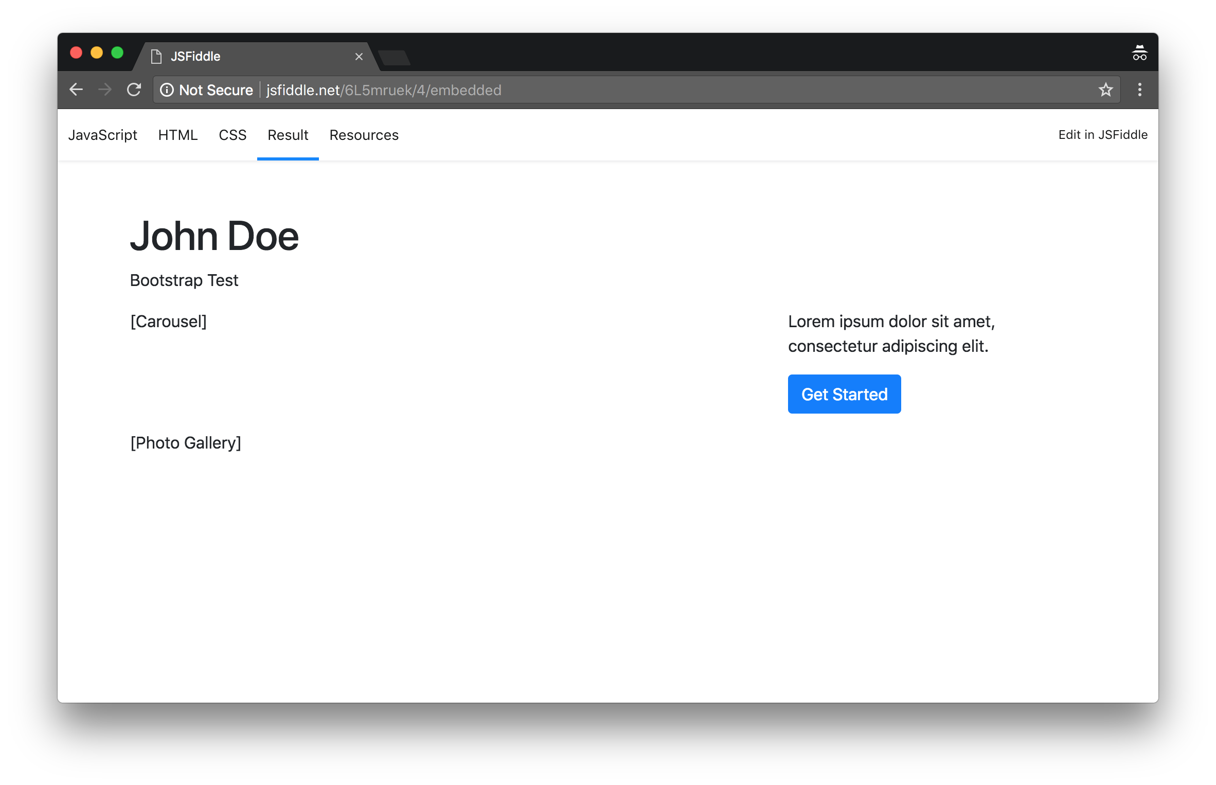
Refer to the following screenshot and construct a simple placeholder of a layout:
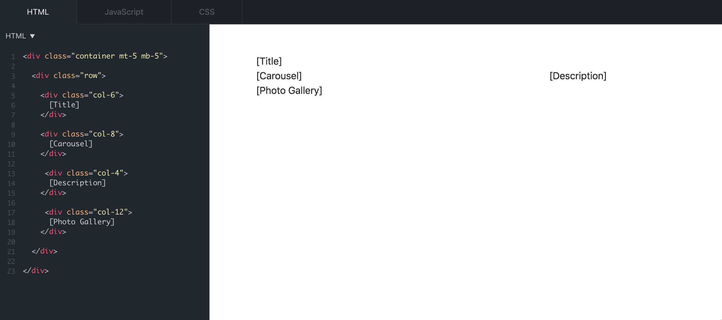
Note that the above example constructs a total of four columns, taking up 50%, 75%, 25%, and 100% of the horizontal space respectively. This, as a result, creates a stacked layout as each column component is pushed to the next line should there be insufficient space in the current one.
More Information
Be advised that these col-* elements must be nested under "row" elements, and that you must start with a "container" (http://getbootstrap.com/docs/4.6/layout/overview/#containers) element to indicate the start of a web page. Also, keep in mind that you can activate variable column sizes under different screen sizes by using Bootstrap-provided class names (http://getbootstrap.com/docs/4.6/layout/overview/#responsive-breakpoints).
Finally: if you are curious about mt-* class name in the screenshot, note that the latest version of Bootstrap offers a short hand method to set up different margins and paddings (http://getbootstrap.com/docs/4.6/utilities/spacing/).
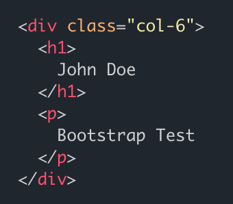
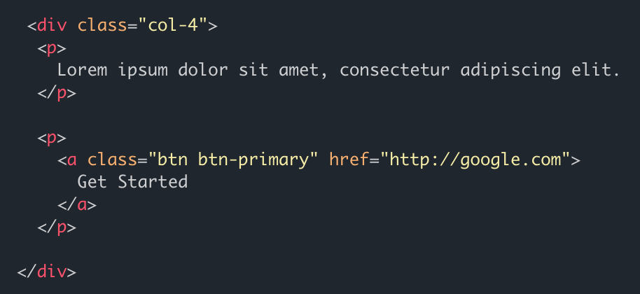
HTML
While [Carousel] and [Photo Gallery] require additional jQuery plugins, we can easily populate the other two placeholders. Refer to the following screenshots and write whatever you deem relevant to the page (refer to https://getbootstrap.com/docs/4.6/components/alerts/ for more information on available components):
We are now ready to start using jQuery plugins:
Screencast Recording
https://www.dropbox.com/scl/fi/9kksp1wwaplw8ei1d0tl6/Page-1.mov?rlkey=oag1rjum6pmylpwrtbce837ce&dl=0