Device Testing
Simulating Devices
You may upload your website on the server and access it using your real handheld device, but you can also take advantage of Chrome's "Device Toolbar" mode, accessed via Inspect Element. Note that the button is located in the left top corner of the window:
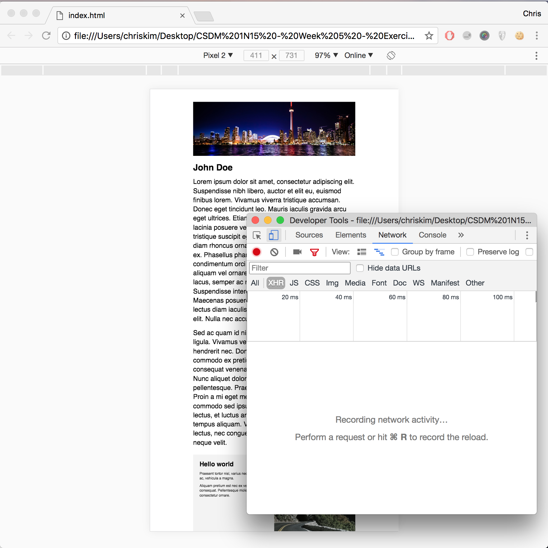
Note that the original browser window shifts and reveals a few dropdown options. You can easily simulate a popular device's dimensions or set your own browser size. Your mouse cursor is replaced with a dark circle, and you should now be able to simulate taps with mouse click.
Here is one more challenge: the website does not seem to be in the mobile view as specified in media query. In fact, the device will zoom out as much possible to reveal the original version of the website (refer to https://www.w3schools.com/css/css_rwd_viewport.asp). As developers, we must force the browser to "respect" the website's dimensions and prevent zooming out.
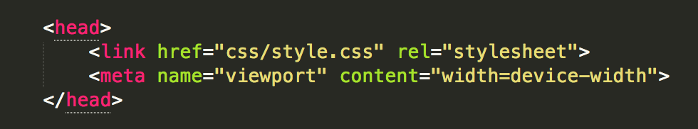
A simple tag in the HTML file will resolve this issue. In short, we are simply telling the mobile / tablet device to keep its own device size, instead of trying to fit the original desktop website. The result is a satisfactory one:
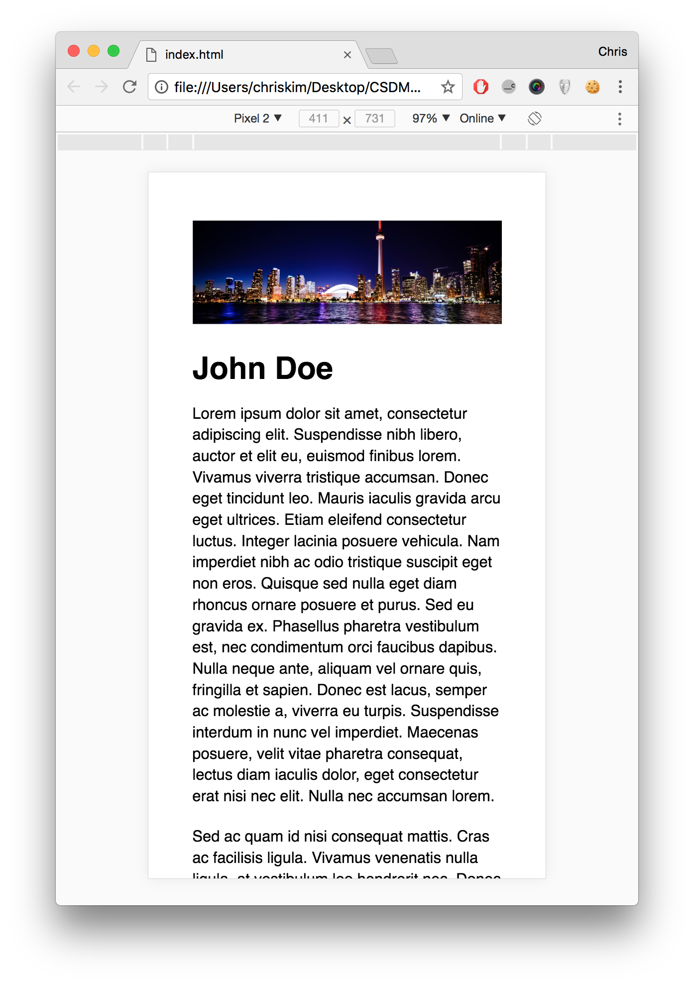
Congratulations --- our website can now be considered fully responsive.
Screencast Recording
https://drive.google.com/file/d/1kmvjy8JF_y3htK0dv_cExBvvjtQTQhkw/view?usp=drive_link
(Updated October 31, 2023)