ckportfolio.com - Getting Started with Responsive Design
Getting Started with Responsive Design
Starting Point
Today's tutorial focuses on a single objective: take an existing page layout and ensure that the page looks good across different screen devices. This can be achieved using responsive design --- or more precisely, a CSS3 feature called media query. As the name suggests, this feature "queries" what device (or "medium") is being used to access the website, and allows specific CSS rules to trigger when a certain condition is satisfied.
To start the tutorial, you can start by downloading the starting kit uploaded on Canvas.
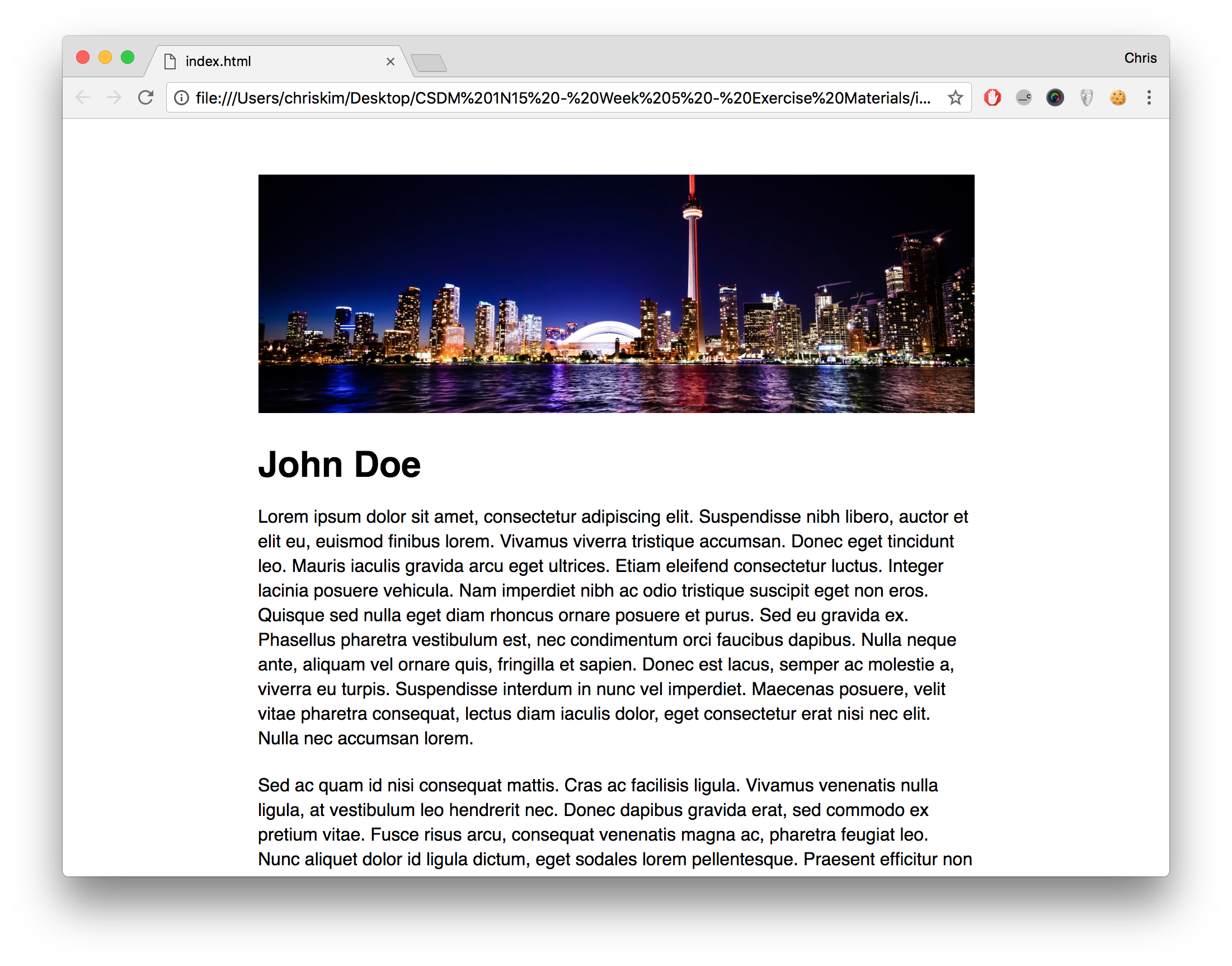
The result is a simple one-page website, equipped with a series of text and image objects:
Screencast Recording
N/A