Responsive Design
Media Query
Media queries can be described as conditional statements: if the user's browser satisfies a certain set of conditions, whatever that is placed between the subsequent pair of braces will be activated. Consider the following example:
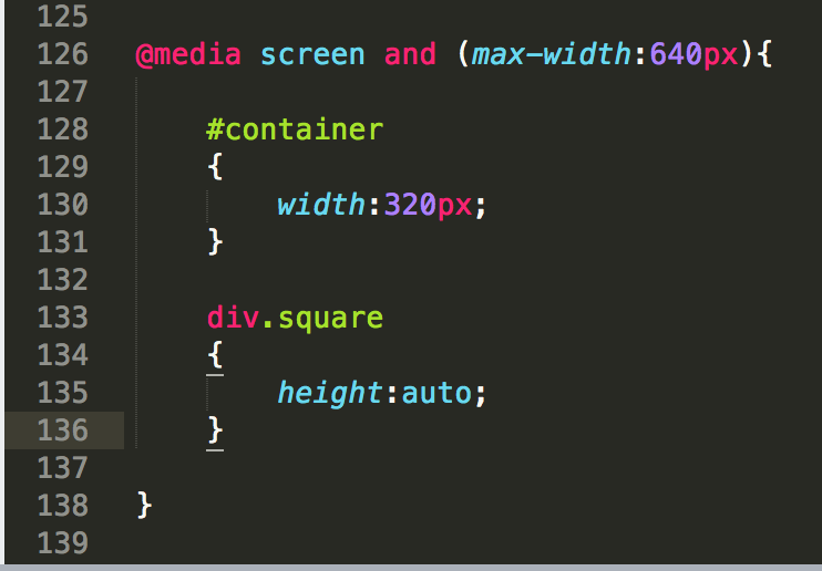
Try to decipher whatever that means. In plain English, the above statement reads as the following:
"If the user's device is a screen, and happens to be equal to or less than 640px wide ... set the #container element's width to 320px, and make sure that the height of each individual square element is calculated automatically."
After applying the above code, see what happens to your website when the browser is resized to be small than 640px in width:
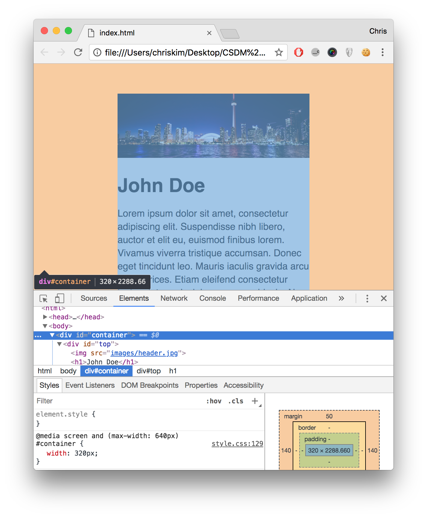
You can verify that the media query kicks in only when the browser matches the aforementioned conditions. It's that easy --- we now have the page optimized for mobile access.
How about widescreen accommodation, where the screen is wide enough to accommodate all of four squares in a single horizontal file?
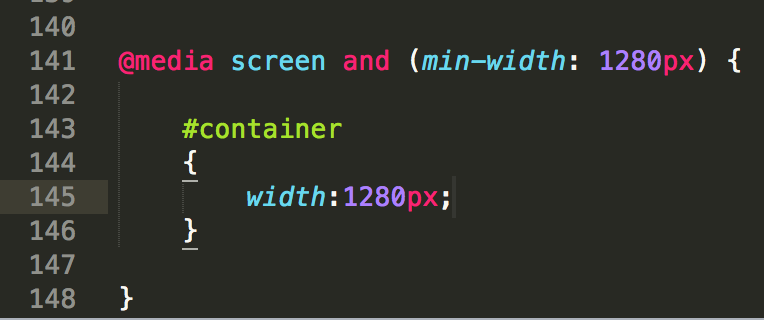
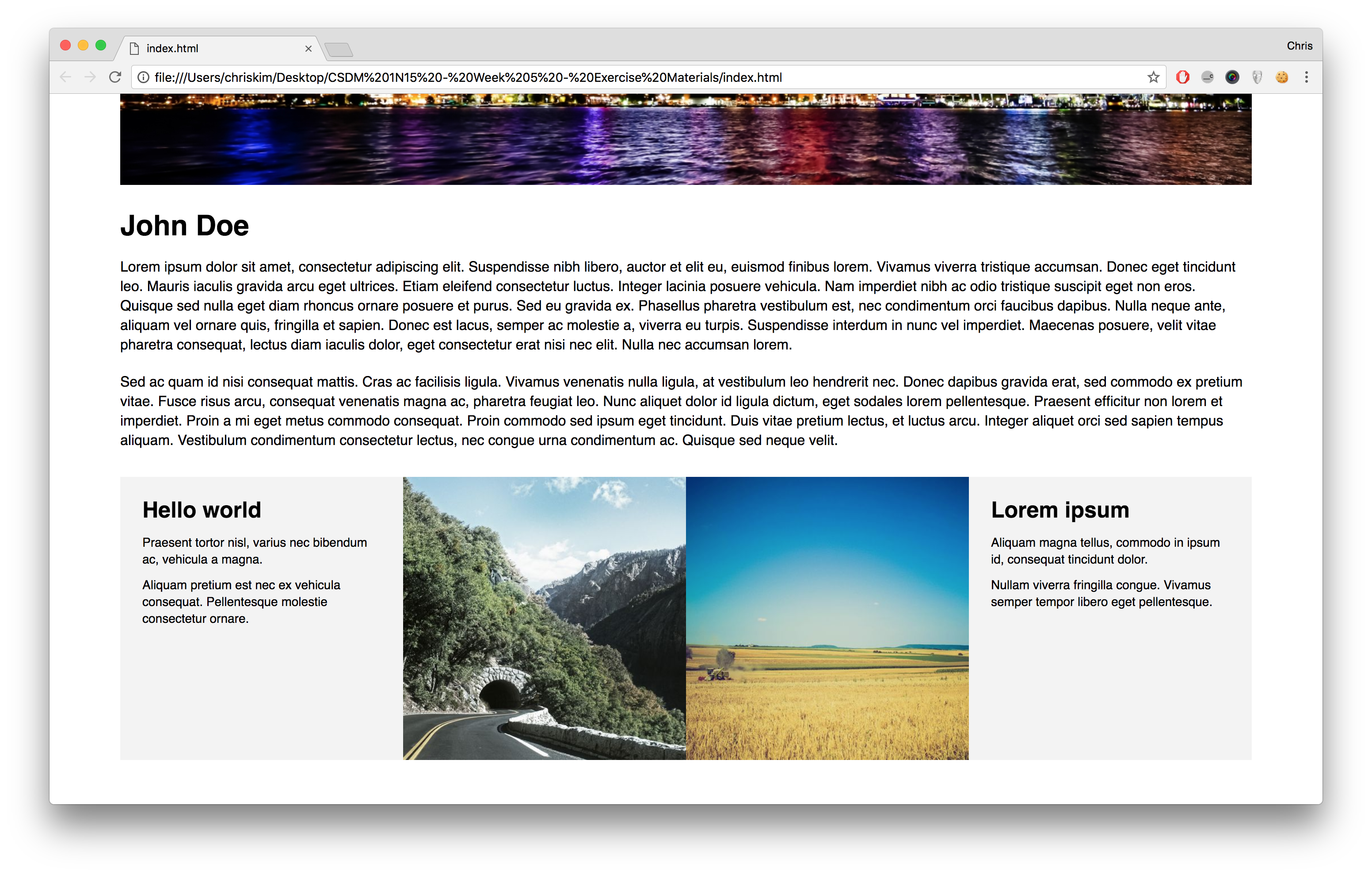
Because they add up to 1280px in width, we can activate the widescreen mode when the browser happens to be wider than 1280px in width. The result, as you can imagine, is the following:
Here, we have one more item left: testing the website on real or simulated devices.
Screencast Recording
https://drive.google.com/file/d/16x9JXQakUfnjTWfEwDNt2pReFxD8lZTV/view?usp=drive_link
(Updated October 31, 2023)